Purpose
There are several representations depending on the type of data under consideration. Several visualization are proposed
Outcome visualization
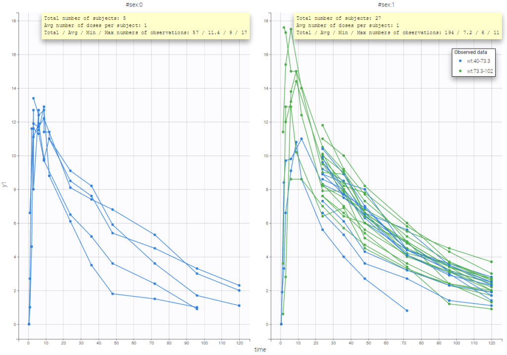
The representation of the outcome w.r.t. time is proposed in the Dataviewer frame.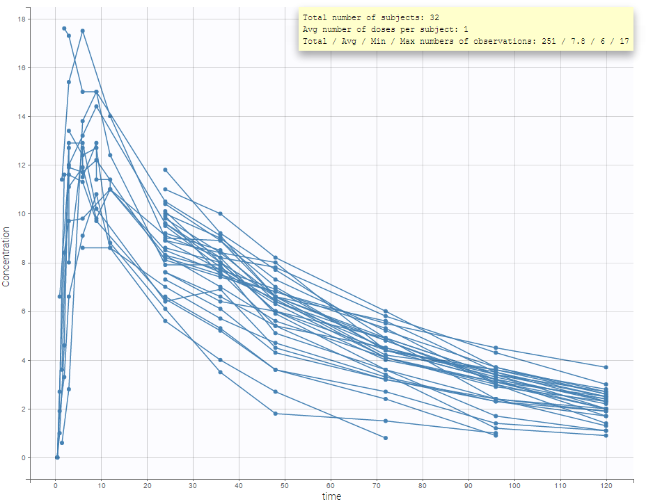
It is possible to play with the axes to have a log-scale display as on the following: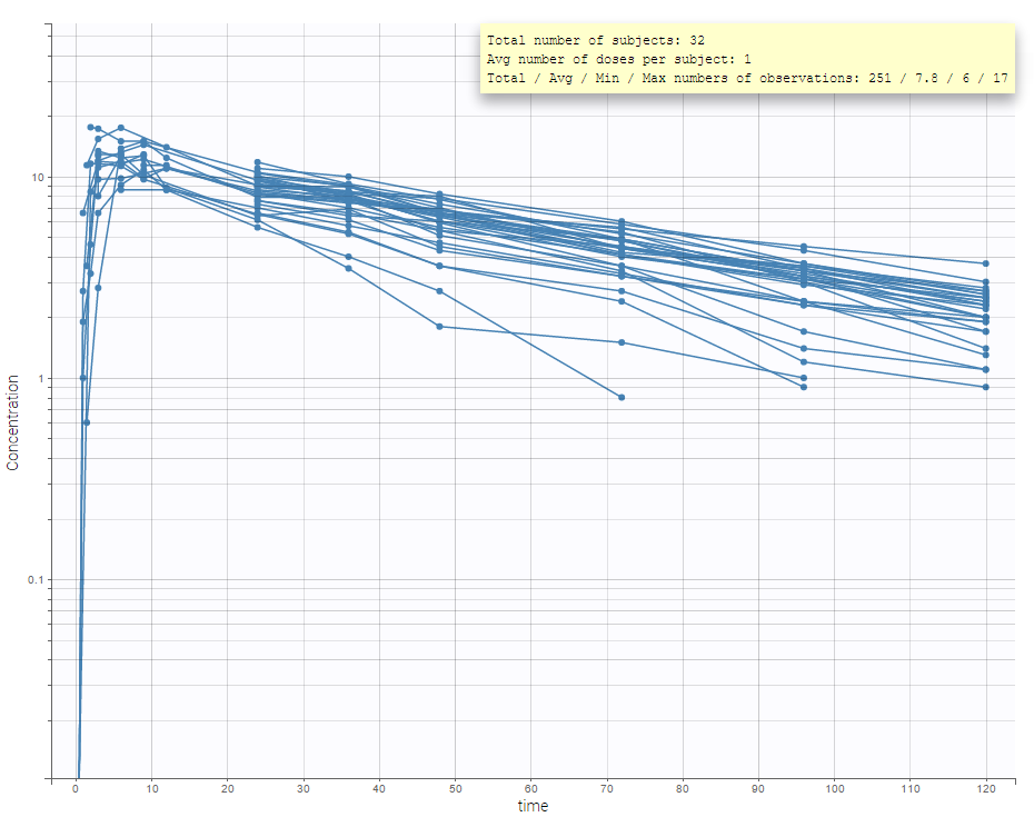
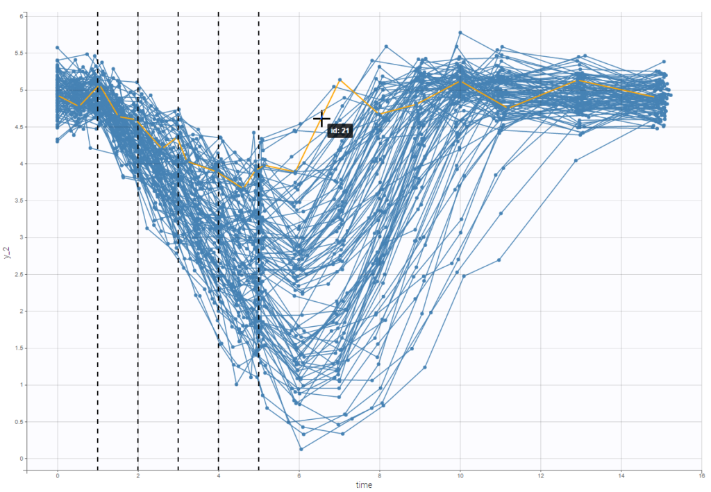
An interesting feature is the possibility to display the dosing times as on the figure below. In the proposed example (PKVK_project of the demos), the individual dosing time of the individual is displayed when the user hovers over an individual’s data.
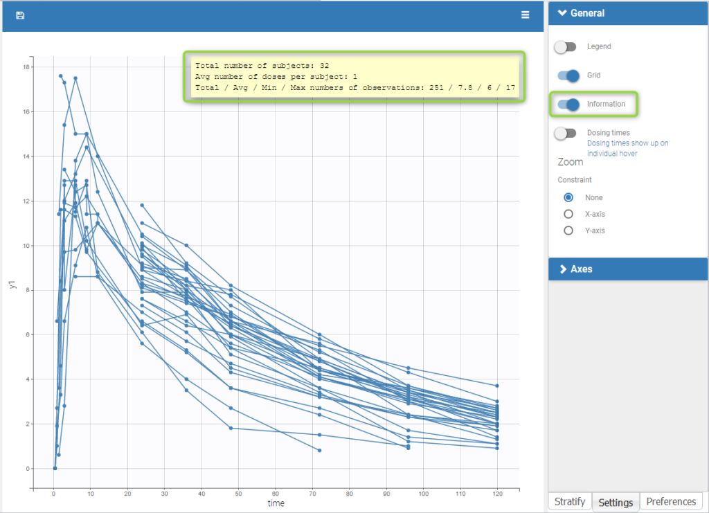
Informations are also provided with:
- The total number of subjects
- The average number of doses per subject
- The total, average, minimum and maximum number of observations per individual.
In addition, if we split the graphic based on a covariate, the informations adapt to the subplots:
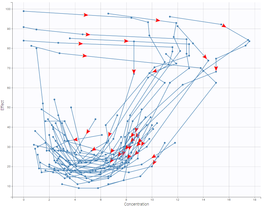
In case of several continuous outputs, one can plot one outcome w.r.t. another one as on the following figure for the warfarin data set. The direction of time is indicated by the red arrow.
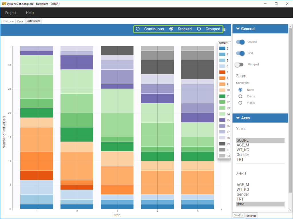
For discrete outcomes, it is possible to display the outcome both as continuous outcomes or stacked as on the following figure corresponding to the Zylkene data set.
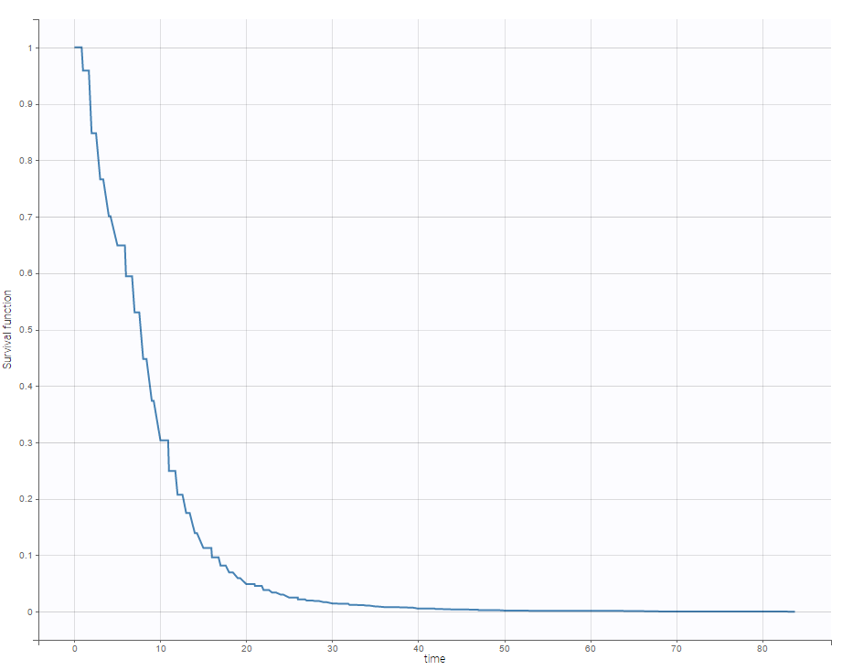
For time-to-event data, one can see the empirical Kaplan-Meier plot of the first event as on the following example of the length of hospital stay for cardiovascular patients.
Covariate visualization
It is possible to display one covariate vs another one. In the following figure, we display the age versus the wt and show the correlation coefficient as an information.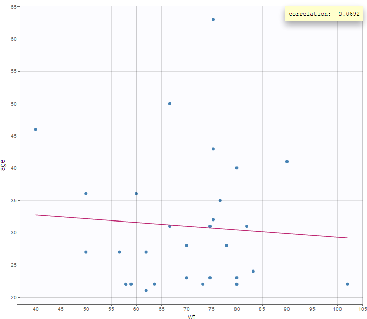
We can also display categorical covariates w.r.t. an another categorical covariate as an histogram (stacked or grouped), 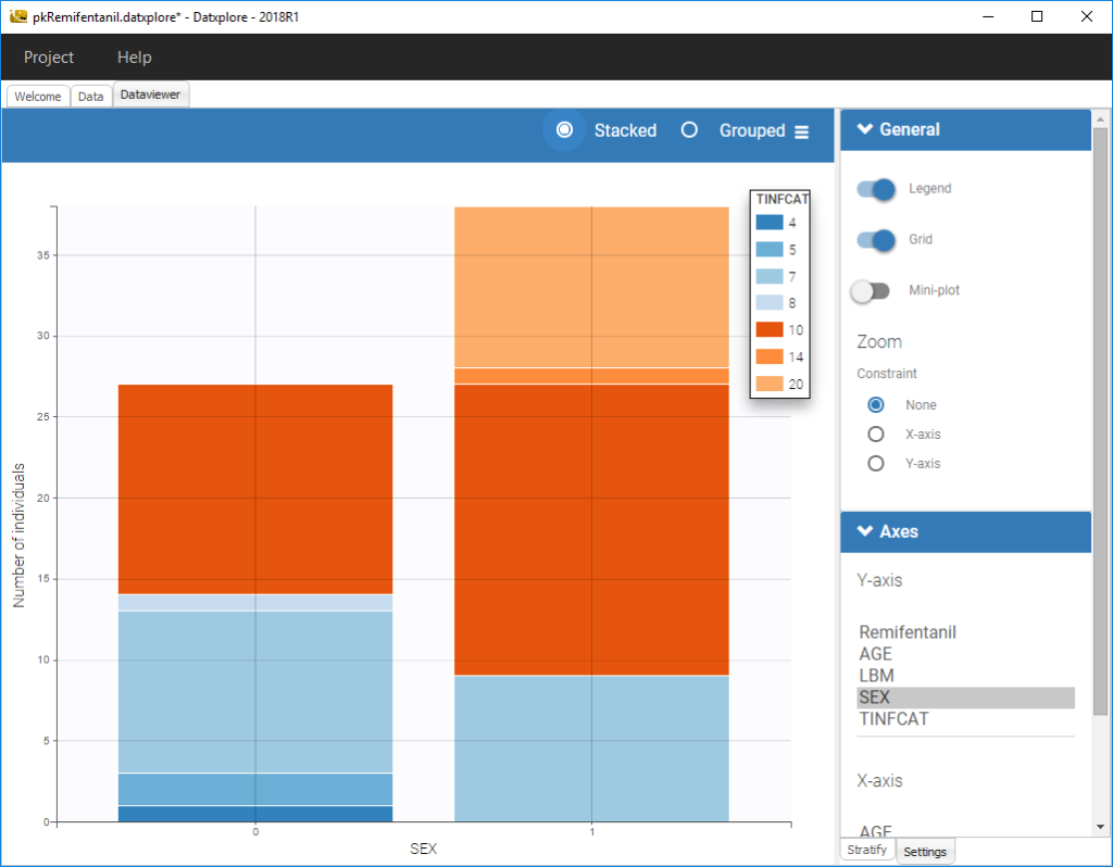
and a continuous covariate w.r.t. a categorical covariate as a boxplot as on the following example.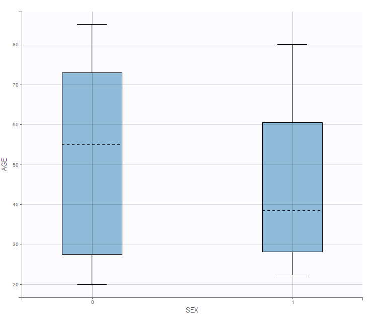
Starting from the 2019 version, it is possible to show the matrix of the covariates as on the following figure
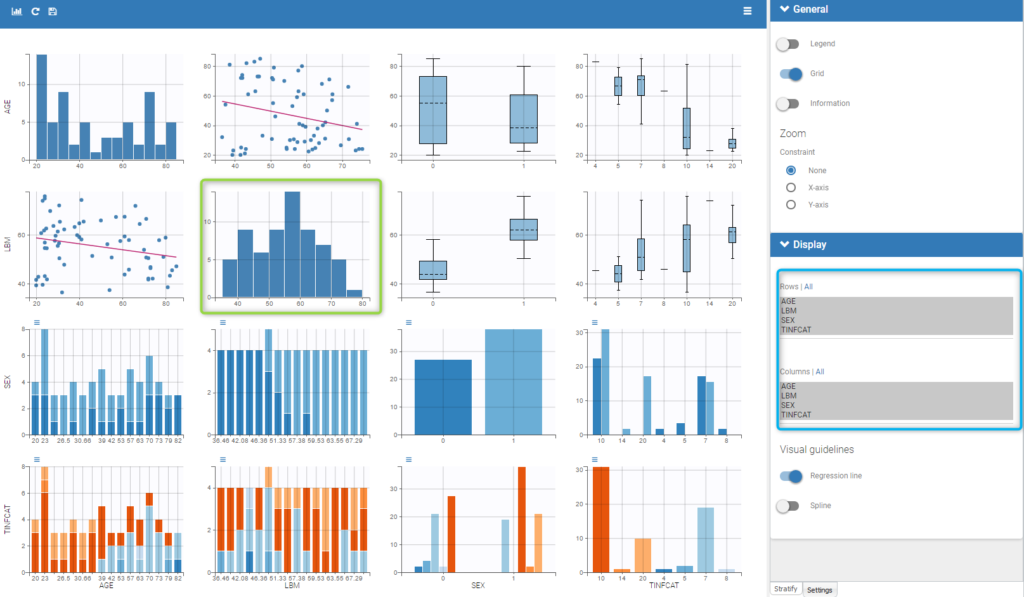
It is thus possible to have the distribution of a covariate (the diagonal plots of the “matrix”) as the distribution of the LBM in the green box in the figure and also to choose the rows and columns to display in the settings on the right (in the blue box of the figure).
Covariate statistics
Starting from the 2019 version, it is possible to get the covariate statistics in a dedicated frame of the interface as can be seen in the following figure.
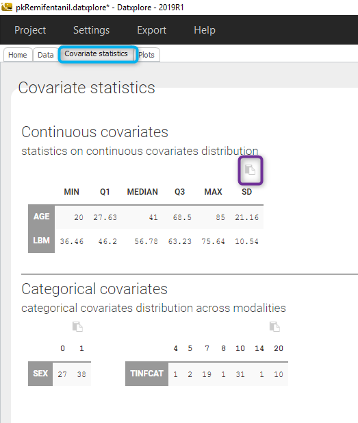
All the covariates (if any) are displayed and a summary of the statistics is proposed. For continuous covariates, minimum, median and maximum values are proposed along with the first and third quartile, and the standard deviation. For categorical covariates, all the modalities are displayed along with the number of each.
Notice that there is a “Copy table” button that allows to copy the table in Wors, Excel, … The format and the display of the table will be preserved.