Interacting with the plots
Within the frame Dataviewer, the right part of the interface holds a panel with several tabs to interact with the plots:
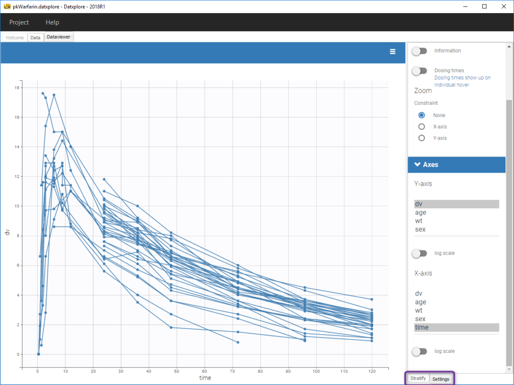
- The tab
Settingsprovides options specific to each plot, such as hiding or displaying elements of the plot, modifying some elements, or changing axes scales and limits. - The tab
Stratifycan be used to select one or several covariates for splitting, filtering or coloring the points of the plot.
Stratification: split, color, filter
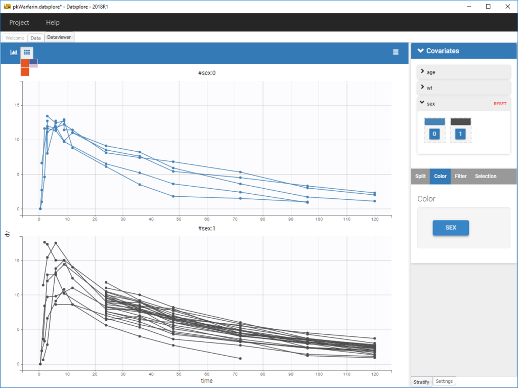
The stratification panel allows to create and use covariates for stratification purposes. It is possible to select one or several covariates for splitting, filtering or coloring the data set or the diagnosis plots as exposed on the following video. Notice that all the observed data plot is the same in Monolix and Datxplore.
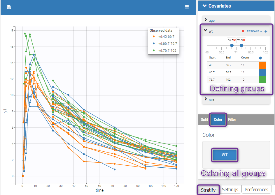
The following figure shows a plot of the observed data from the warfarin dataset, stratified by coloring individuals according to the continuous covariate wt: the observed data is divided into three groups, which were set to equal size with the button “rescale”. It is also possible to set groups of equal width, or to personalize dividing values.
In addition, starting from the 2019 version, the bounds of the continuous covariate groups can be changed manually.
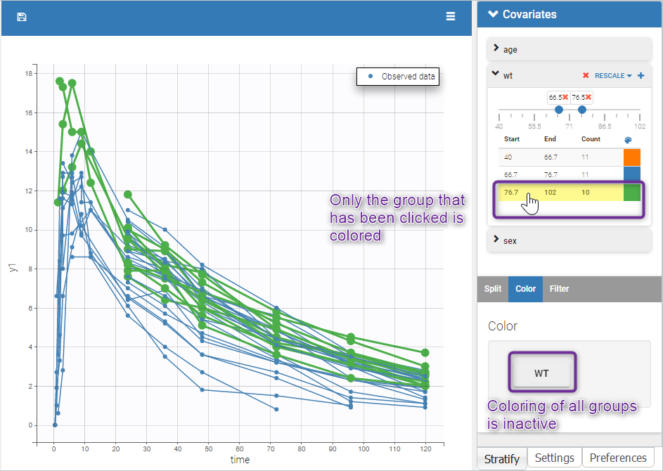
Moreover, clicking on a group highlights only the individuals belonging to this group, as can be seen below:
Values of categorical covariates can also be assigned to new groups, which can then be used for stratification.
In addition, starting from the 2019 version, the number of subjects in each categorical covariate groups is displayed.
Layout
The layout can be modified with buttons on top of each plot to select the number of plots (green highlight below), to arrange the layout (purple highlight below) and to remove the settings frame (pink highlight).
![]()
The layout button (second button) can be used to select predefined layouts for the subplots, for instance all subplots in one row or all subplots in one column.