1.Home
Version 2024
This documentation is for Datxplore starting from 2018 version.
©Lixoft
Purpose
Datxplore is a graphical and interactive software for the exploration and visualization of data. Data set under consideration are for population modeling as defined here. Datxplore provides various plots and graphics (box plots, histograms, survival curves…) to study the statistical properties of discrete and continuous data, and to analyze the behavior depending on covariates, individuals, etc. It can be used to
- See the PK dynamics over time with the possibility of display in log-scale.
- See if there are outliers.
- See the PD versus the PK.
- Split, color and filter the data set to see the dependency of the outcome w.r.t. the covariates.
- See a covariate with respect to another covariate and see the correlation.
Notice that starting from the 2019 version, it is possible to export the Datxplore project to Monolix.
Layout
The graphical interface comprises three main parts. A HOME frame, a Data frame to manage your data set and a frame to explore the data set.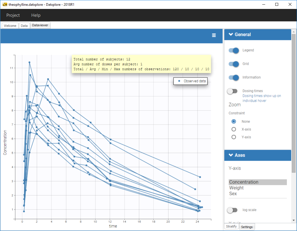
Data selection
The applicable datasets are those dedicated to population modeling. The population approach describes phenomena observed in a set of individuals and the variability between individuals. The data is thus individual data, and is often longitudinal (over time). For each subject, the dataset contains measurements, the dose regimen, covariates, etc., i.e. all collected information.
The first thing to do is to choose a dataset and tag the columns according to the column-types defined here.
Supported file types: Supported file types include .txt, .csv, and .tsv files. Starting with version 2024, additional Excel and SAS file types are supported: .xls, .xlsx, .sas2bdat, and .xpt files in addition to .txt, .csv, and .tsv files.
Data manipulation
Used to select, filter or split data. See Data manipulation section.
Data visualization
In the Dataviewer frame, the user can see all the possible figures. See Data visualization section.
2.Data selection
Data set structure
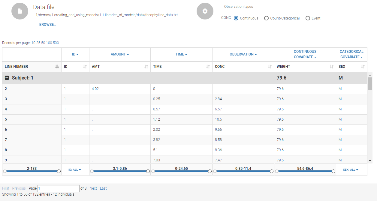
The data set structure contains for each subject measurements, dose regimen, covariates etc … i.e. all collected information. The data must be in the long format, i.e each line corresponds to one individual and one time point. Different type of information (dose, observation, covariate, etc) are recorded in different columns, which must be tagged with a column type (see below). The column types are very similar and compatible with the structure used by the Nonmem software (the differences are listed here). This is specified when the user defines each column type in the data set as in the following picture.
 Notice that Monolix often provides an initial guess of the type of the column depending on the name.
In addition, we have a button DATA VIEWER that allows to explore the data set as Datxplore.
Description of column-types
The first line of the data set must be a header line, defining the names of the columns. The columns names are completely free. In the MonolixSuite applications, when defining the data, the user will be asked to assign each column to a column-type (see here for an example of this step). The column type will indicate to the application how to interpret the information in that column. The available column types are given below:
Column-types used for all types of lines:
- ID (mandatory): identifier of the individual
- OCCASION (formerly OCC): identifier (index) of the occasion
- TIME: time of the dose or observation record
- DATE/DAT1/DAT2/DAT3: date of the dose or observation record, to be used in combination with the TIME column
- EVENT ID (formerly EVID): identifier to indicate if the line is a dose-line or a response-line
- IGNORED OBSERVATION (formerly MDV): identifier to ignore the OBSERVATION information of that line
- IGNORED LINE (from 2019 version): identifier to ignore all the information of that line
- CONTINUOUS COVARIATE (formerly COV): continuous covariates (which can take values on a continuous scale)
- CATEGORICAL COVARIATE (formerly CAT): categorical covariate (which can only take a finite number of values)
- REGRESSOR (formerly X): defines a regression variable, i.e a variable that can be used in the structural model (used e.g for time-varying covariates)
- IGNORE: ignores the information of that column for all lines
Column-types used for response-lines:
- OBSERVATION (mandatory, formerly Y): records the measurement/observation for continuous, count, categorical or time-to-event data
- OBSERVATION ID (formerly YTYPE): identifier for the observation type (to distinguish different types of observations, e.g PK and PD)
- CENSORING (formerly CENS): marks censored data, below the lower limit or above the upper limit of quantification
- LIMIT: upper or lower boundary for the censoring interval in case of CENSORING column
Column-types used for dose-lines:
- AMOUNT (formerly AMT): dose amount
- ADMINISTRATION ID (formerly ADM): identifier for the type of dose (given via different routes for instance)
- INFUSION RATE (formerly RATE): rate of the dose administration (used in particular for infusions)
- INFUSION DURATION (formerly TINF): duration of the dose administration (used in particular for infusions)
- ADDITIONAL DOSES (formerly ADDL): number of doses to add in addition to the defined dose, at intervals INTERDOSE INTERVAL
- INTERDOSE INTERVAL (formerly II): interdose interval for doses added using ADDITIONAL DOSES or STEADY-STATE column types
- STEADY STATE (formerly SS): marks that steady-state has been achieved, and will add a predefined number of doses before the actual dose, at interval INTERDOSE INTERVAL, in order to achieve steady-state
Loading a new data set
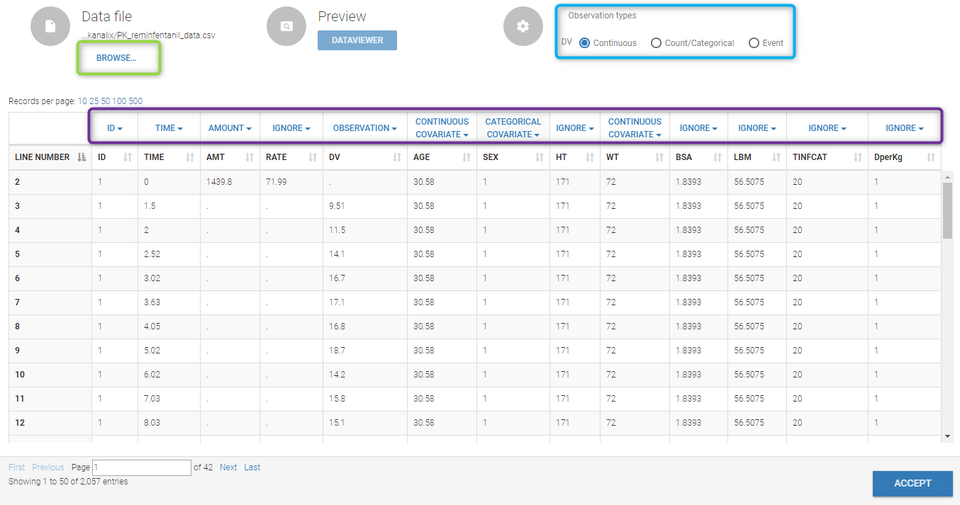
To load a new data set, you have to go to “Browse” your data set (green frame), tag all the columns (purple frame), define the observation types, and click on the blue button ACCEPT as on the following.
Observation type
There are three types of observations
- continuous: The observation is continuous with respect to time. For example, a concentration is a continuous observation.
- count/categorical: The observation values takes place in a finite categorical space. For example, the observation can be a categorical observation (an effect can be observed as low, medium, high) or a count observation over a defined time (the number of epileptic crisis in a defined time).
- event: The observation is an event, for example the occurring of an epileptic crisis.
The type of observations can be specified by the user in the interface.
Labeling
The name proposed in the figure and in the data choice is the one defined in the label. The user can modify it. By default, the label used is the one defined in the data set.
Starting from the 2019 version, it is possible to change your preferences. By clicking on Settings>Preferences, the following windows pops up.
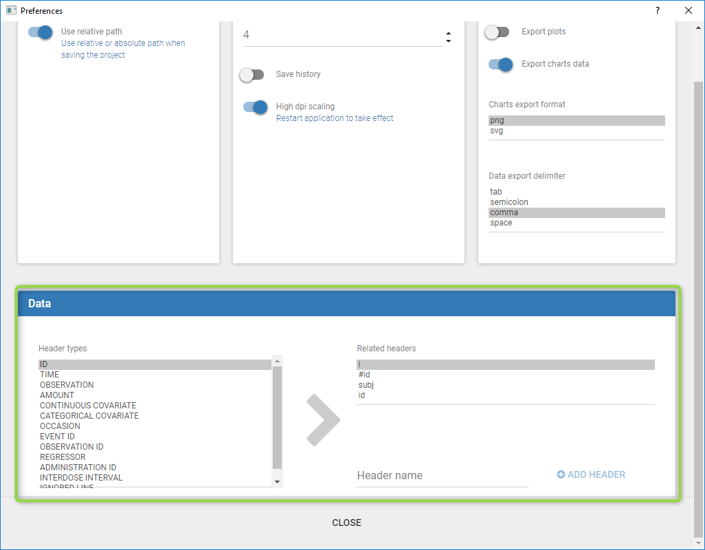
In the DATA frame, you can add or remove preferences for each column.
To remove a preference, double-click on the preference you would like to remove. A confirmation window will be proposed.
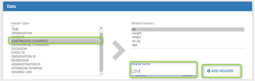
To add a preference, click on the header type you consider, add a name in the header name and click on “ADD HEADER” as on the following figure.
Notice that all the preferences are shared between Monolix, Datxplore, and PKanalix.
Filtering
Starting from the 2020 version, we added the possibility to filter the data set as can be seen here.
3.Data manipulation
Interacting with the plots
Within the frame Dataviewer, the right part of the interface holds a panel with several tabs to interact with the plots:
- The tab
Settingsprovides options specific to each plot, such as hiding or displaying elements of the plot, modifying some elements, or changing axes scales and limits. - The tab
Stratifycan be used to select one or several covariates for splitting, filtering or coloring the points of the plot.
Stratification: split, color, filter
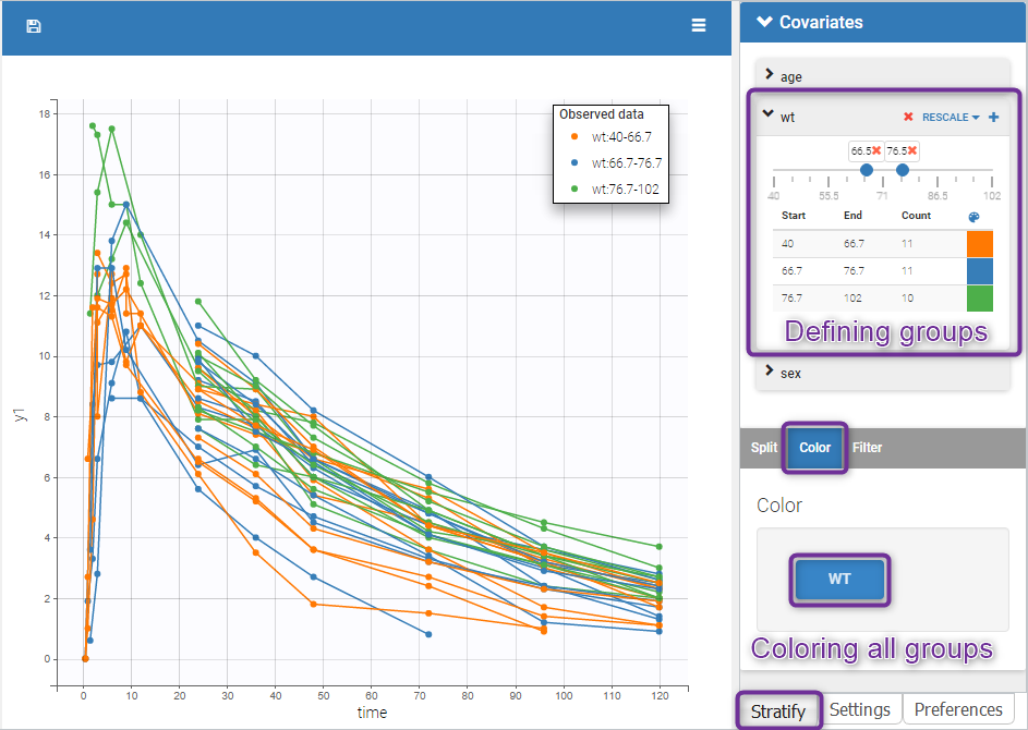
The stratification panel allows to create and use covariates for stratification purposes. It is possible to select one or several covariates for splitting, filtering or coloring the data set or the diagnosis plots as exposed on the following video. Notice that all the observed data plot is the same in Monolix and Datxplore.
The following figure shows a plot of the observed data from the warfarin dataset, stratified by coloring individuals according to the continuous covariate wt: the observed data is divided into three groups, which were set to equal size with the button “rescale”. It is also possible to set groups of equal width, or to personalize dividing values.
In addition, starting from the 2019 version, the bounds of the continuous covariate groups can be changed manually.
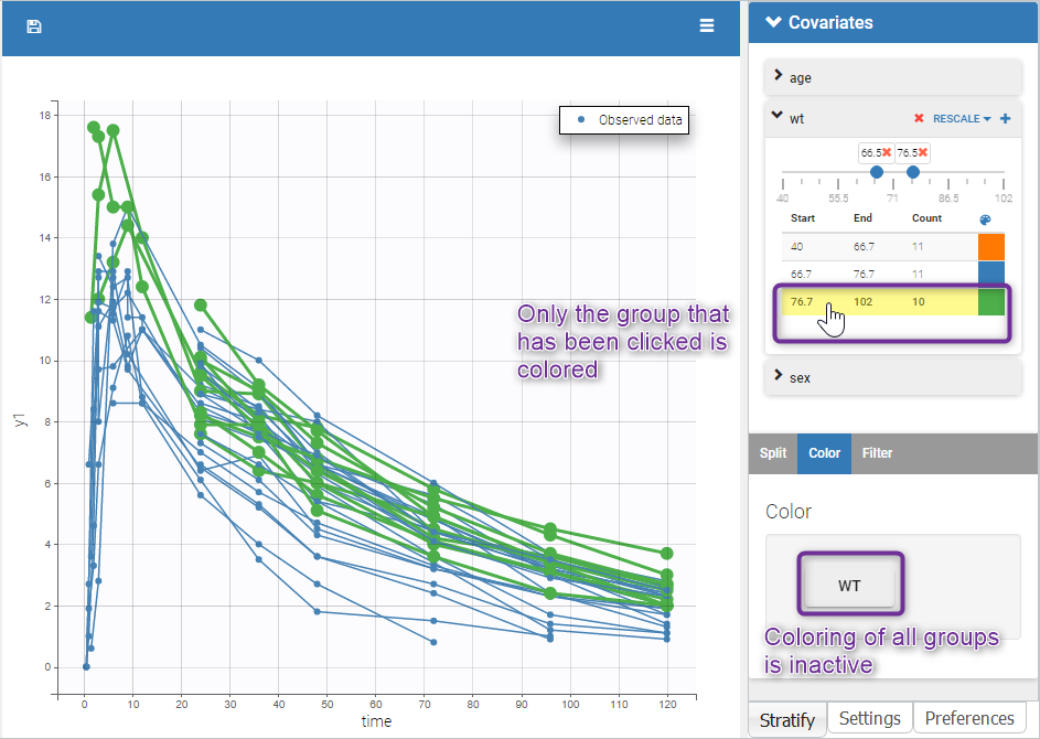
Moreover, clicking on a group highlights only the individuals belonging to this group, as can be seen below:
Values of categorical covariates can also be assigned to new groups, which can then be used for stratification.
In addition, starting from the 2019 version, the number of subjects in each categorical covariate groups is displayed.
Layout
The layout can be modified with buttons on top of each plot to select the number of plots (green highlight below), to arrange the layout (purple highlight below) and to remove the settings frame (pink highlight).
![]()
The layout button (second button) can be used to select predefined layouts for the subplots, for instance all subplots in one row or all subplots in one column.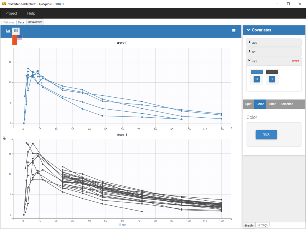
4.Data vizualization
Purpose
There are several representations depending on the type of data under consideration. Several visualization are proposed
Outcome visualization
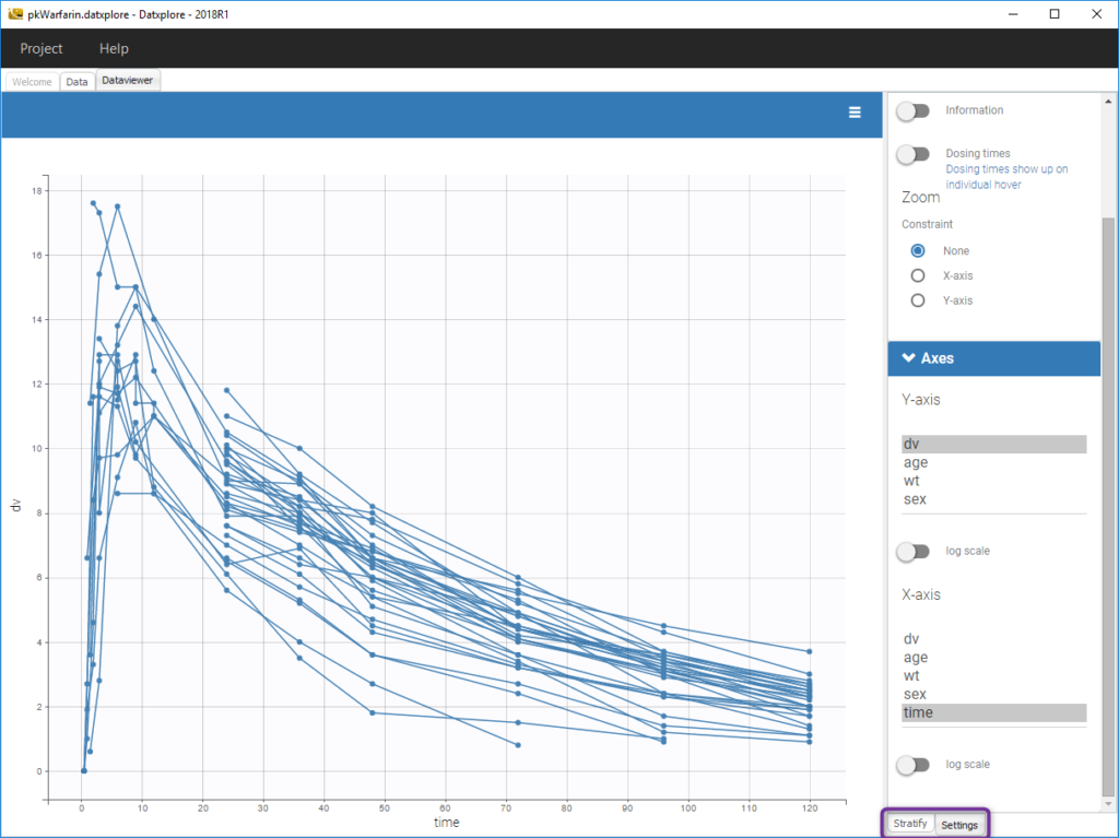
The representation of the outcome w.r.t. time is proposed in the Dataviewer frame.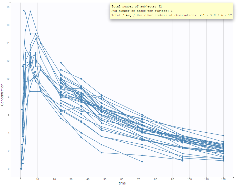
It is possible to play with the axes to have a log-scale display as on the following: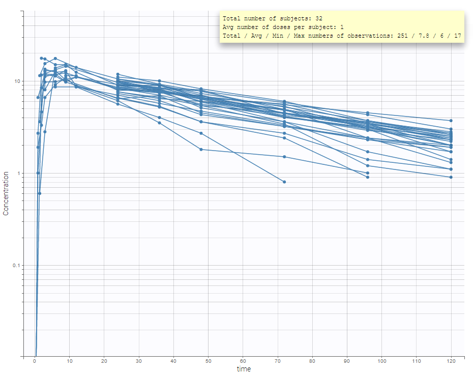
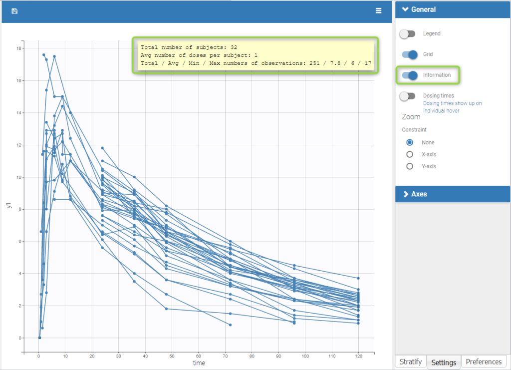
An interesting feature is the possibility to display the dosing times as on the figure below. In the proposed example (PKVK_project of the demos), the individual dosing time of the individual is displayed when the user hovers over an individual’s data.
Informations are also provided with:
- The total number of subjects
- The average number of doses per subject
- The total, average, minimum and maximum number of observations per individual.
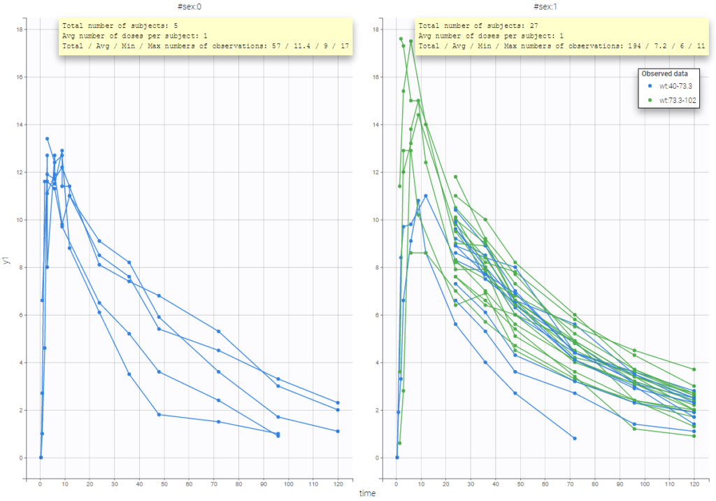
In addition, if we split the graphic based on a covariate, the informations adapt to the subplots:
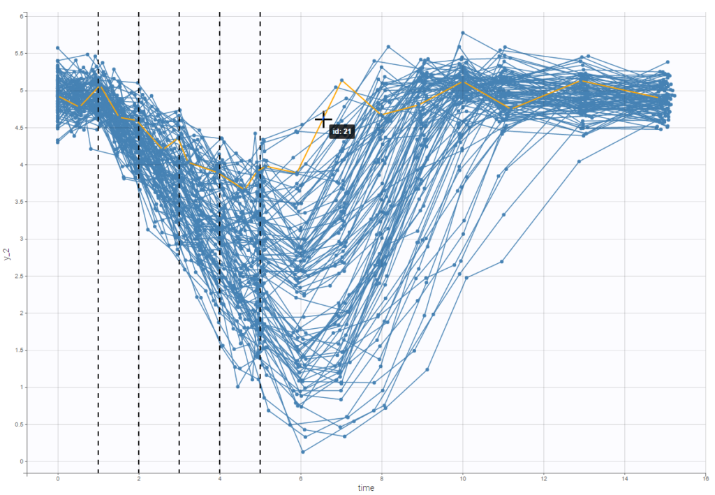
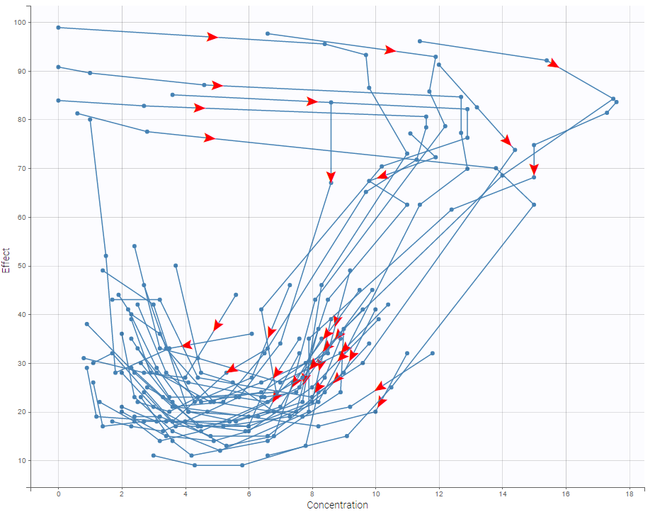
In case of several continuous outputs, one can plot one outcome w.r.t. another one as on the following figure for the warfarin data set. The direction of time is indicated by the red arrow.
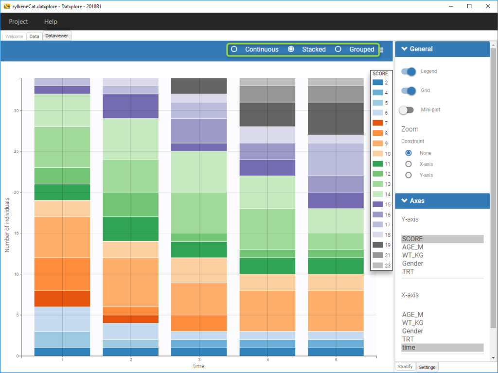
For discrete outcomes, it is possible to display the outcome both as continuous outcomes or stacked as on the following figure corresponding to the Zylkene data set.
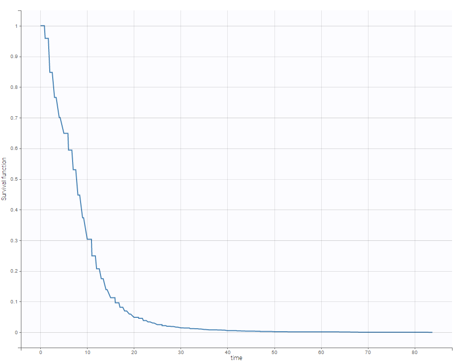
For time-to-event data, one can see the empirical Kaplan-Meier plot of the first event as on the following example of the length of hospital stay for cardiovascular patients.
Covariate visualization
It is possible to display one covariate vs another one. In the following figure, we display the age versus the wt and show the correlation coefficient as an information.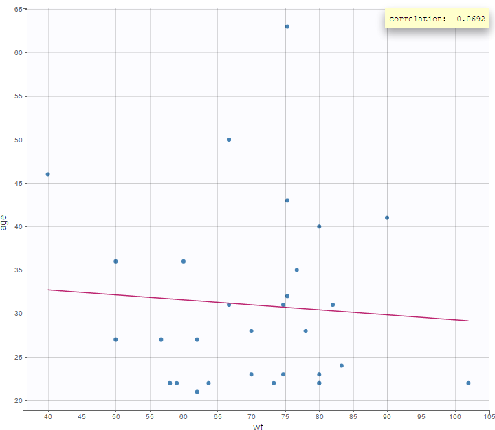
We can also display categorical covariates w.r.t. an another categorical covariate as an histogram (stacked or grouped), 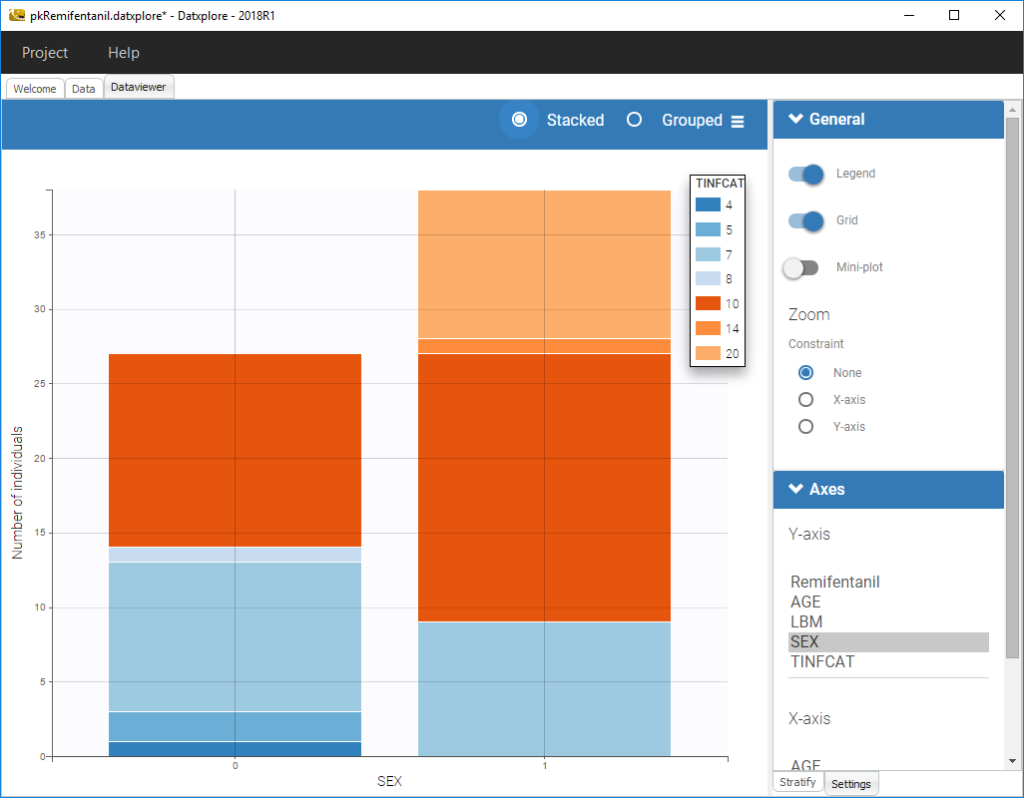
and a continuous covariate w.r.t. a categorical covariate as a boxplot as on the following example.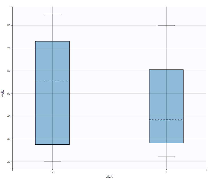
Starting from the 2019 version, it is possible to show the matrix of the covariates as on the following figure
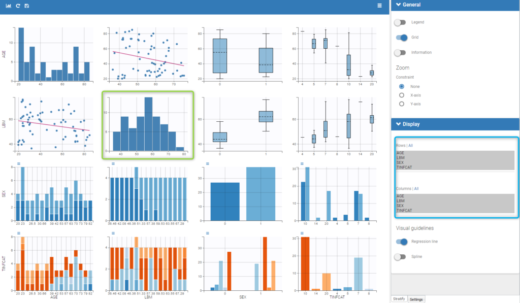
It is thus possible to have the distribution of a covariate (the diagonal plots of the “matrix”) as the distribution of the LBM in the green box in the figure and also to choose the rows and columns to display in the settings on the right (in the blue box of the figure).
Covariate statistics
Starting from the 2019 version, it is possible to get the covariate statistics in a dedicated frame of the interface as can be seen in the following figure.
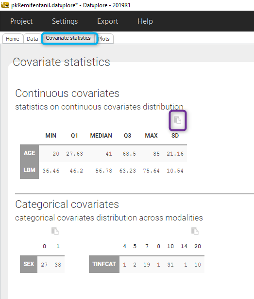
All the covariates (if any) are displayed and a summary of the statistics is proposed. For continuous covariates, minimum, median and maximum values are proposed along with the first and third quartile, and the standard deviation. For categorical covariates, all the modalities are displayed along with the number of each.
Notice that there is a “Copy table” button that allows to copy the table in Wors, Excel, … The format and the display of the table will be preserved.